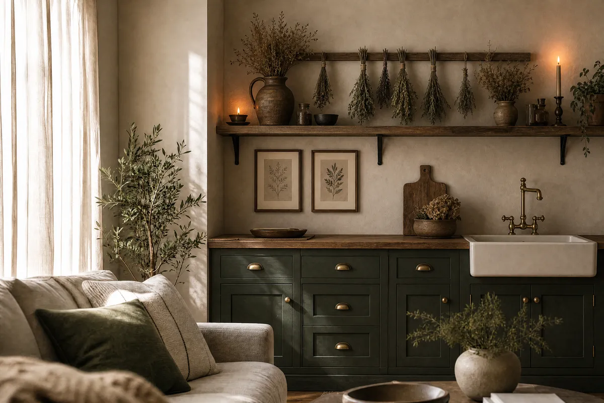
Cottagecore spent years as a sun-drenched fantasy: gingham, wildflowers, bread on a windowsill. Dark cottagecore keeps the nostalgia and the hand-made textures but trades the morning light for late afternoon — deeper colors, heavier woods, a little Victorian shadow. In the kitchen, that translates into a room that feels like it has been cooking for a century.
Is dark cottagecore actually a trend, or just a hashtag?
It’s measurable. Pinterest’s official Spring 2026 trend report puts searches for “dark cottagecore kitchen” up 915% year over year, alongside “grandma core kitchen” up 545% — both filed under a broader comfort-and-nostalgia wave in home renovation. Pinterest publishes these numbers from its own search data, and since Pinterest is where kitchen planning actually happens, the signal is about as close to intent as decor data gets.
Why now is less mysterious than trend reports make it sound: after years of white-and-gray kitchens engineered to photograph well, people want rooms that feel inhabited. Dark cottagecore is essentially permission to make the kitchen cozy again — and unlike a cabinet repaint, most of the look can be layered on top of a plain kitchen you already have.
What defines the dark cottagecore look?
Five recognizable ingredients, roughly in order of impact:
| Element | Light cottagecore version | Dark cottagecore version |
|---|---|---|
| Palette | Cream, blush, soft yellow | Deep green, oxblood, charcoal, warm brown |
| Wood | Whitewashed, light pine | Aged oak, walnut, almost-black stains |
| Art | Pressed flowers, pastel botanicals | Vintage botanical charts, dark still lifes, mushroom and herb plates |
| Textiles | Gingham, white lace | Heavy linen, faded florals on dark grounds |
| Light | Bright and airy | Warm, low, candlelit — brass and amber glass |
The mood target: a Dutch still-life painting you can make tea in. If a corner of your kitchen would look at home in a seventeenth-century oil painting — pewter, dark fruit, deep shadow — you’ve hit it.
How do I get the look with printable art?
Art is the highest-impact, lowest-commitment layer of this trend, and it happens to be the layer printables do best. You are hunting for four categories:
1. Vintage botanical and mushroom charts. The backbone of the look. Aged-paper botanical plates — foraging charts, herb studies, mushroom identification pages — in A4 or 8x10, hung in pairs or trios. Public-domain archives are a goldmine here: the Biodiversity Heritage Library and major museum open-access collections offer scanned botanical plates free, and Etsy sellers offer cleaned-up, print-ready versions for a few dollars.
2. Dark still lifes. Painterly prints of fruit, bread, game birds, pewter jugs against near-black backgrounds. One larger piece (A3 or 11x14) leaning on an open shelf does more than five small ones scattered around.
3. Moody landscape or forest prints. A fog-heavy forest or dusk field print softens a kitchen that’s mostly hard surfaces. Keep it in the same warm-dark palette — cold blue fog reads gothic rather than cottage.
4. Vintage ephemera: recipe pages, seed packets, apothecary labels. Small-format prints (5x7, A5) that live on shelves between crockery rather than on walls. This is the “collected over decades” texture that makes the look believable.
Where sage green fits: sage is dark cottagecore’s daylight ally — it bridges deep green cabinets and cream walls. A few of the muted botanical pieces in our own shop Linoraprint sit on this lighter edge of the palette, and we’ll say plainly that’s our shop, not a neutral pick; for the truly dark end of the spectrum, searching Etsy for “dark academia botanical” or “vintage mushroom chart printable” will surface dozens of independent sellers doing it well.
How do I frame and place art in a kitchen?
Kitchens are hostile territory for paper — heat, steam, and grease all age prints fast (and not in the charming way). Practical rules:
Frame behind glass in the splash zone. Anywhere near the stove or sink, glass-fronted frames protect the print. Save open poster hangers for the far wall.
Use dark, warm frames. Thin black, dark walnut, or antiqued gold. The bright oak that suits Scandinavian prints looks out of place here; this trend wants frames that could plausibly be old.
Lean, don’t just hang. Prints leaning on open shelving between jars and crockery are the signature dark-cottagecore move — the wall above open shelves and the top of a hutch are prime spots.
Cluster small, anchor large. One A3-or-larger anchor piece on the main free wall, then clusters of small ephemera prints among the objects. Symmetric pairs of botanical charts flanking a window or range hood give the “always been here” effect.
Print on matte, never gloss. Gloss ruins the aged-paper illusion instantly. A warm-white or cream-base matte paper (180–250 gsm) is right; some sellers offer files with a built-in parchment tone, which saves you hunting for cream paper. Our complete printing guide covers paper and sizing in detail.
Can I do this without repainting my kitchen?
Yes — that’s the honest appeal of entering this trend through art instead of renovation. A plain white kitchen with five well-chosen dark botanical prints, a dark-framed still life, warm bulbs in place of cool ones, and a heavy linen towel on the oven rail is recognizably dark cottagecore for under the cost of one cabinet door. If you later commit to deep green paint, the art you collected still works; if the trend fades for you, you’ve spent tens of dollars, not thousands.
That reversibility is worth taking seriously when the growth number is this steep. A 915% search spike means the look is everywhere this year; printables let you ride it without betting your kitchen on it.
Sources
- Pinterest Newsroom, Spring Trend Report 2026 — “dark cottagecore kitchen” searches +915% YoY; “grandma core kitchen” +545% YoY.
Pin this guide
Save any of these to your Pinterest boards — they link straight back to this guide.
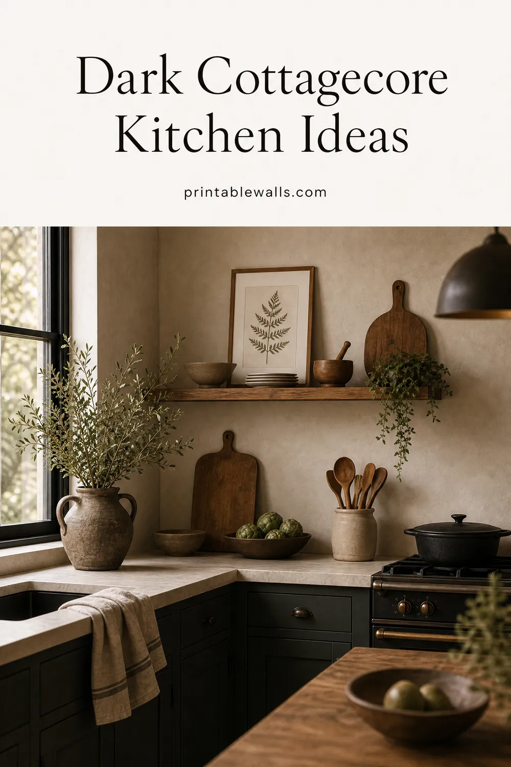
Pin 1 of 2 — save to Pinterest 
Pin 2 of 2 — save to Pinterest