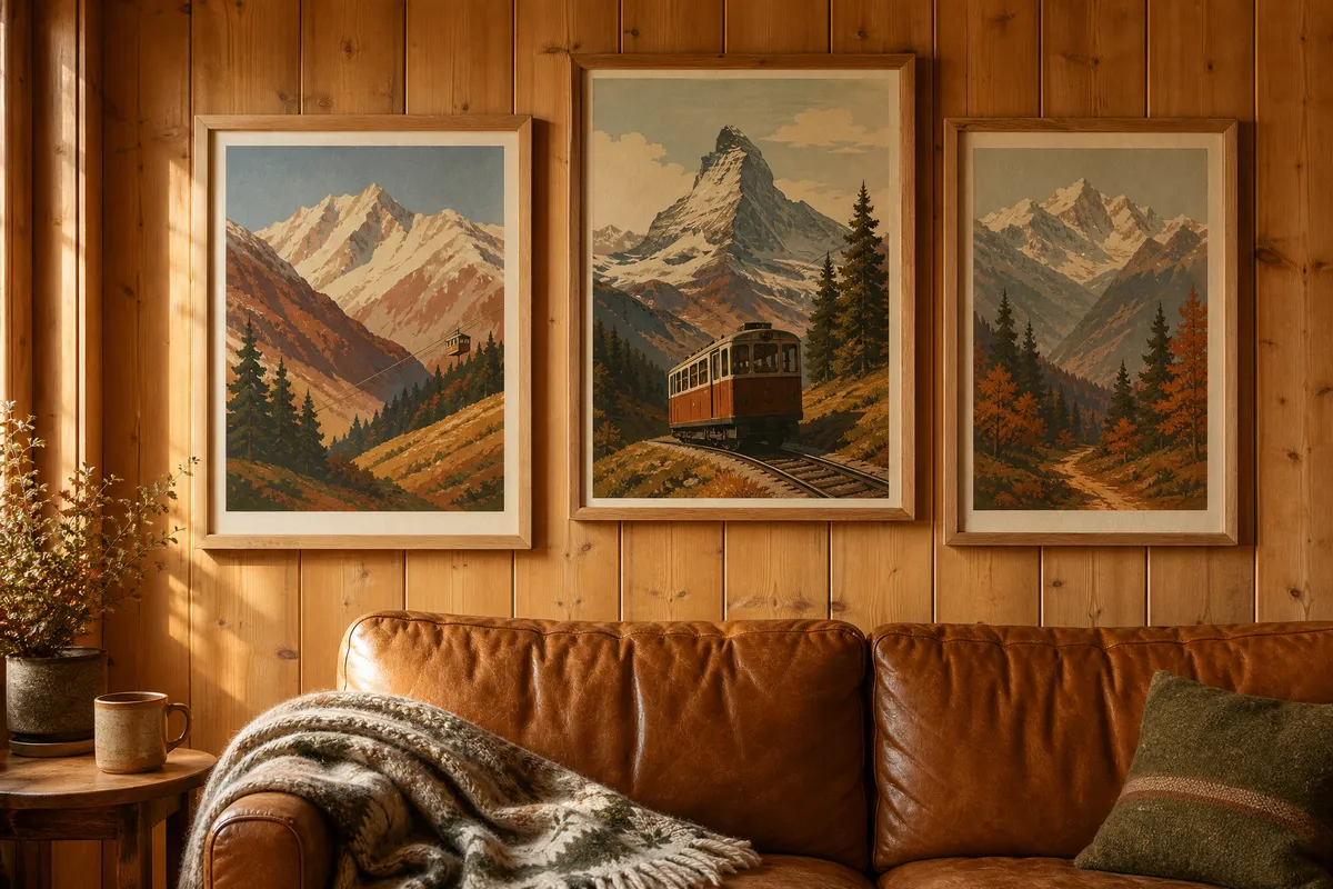
What is Alpine Nostalgia?
It is Country Living’s own coinage, introduced in a piece published on 19 July 2026 by editors Anna Logan and Maddy Ando. They describe it as “a rustic, slightly European approach to the classic ranch aesthetic” and name it the standout look for fall through the Christmas season.
The scene they paint is specific: “colorful, lived-in textiles line leather sofas, vintage posters punctuate timber-clad walls, and a mug of cider is never far away.” Designers Amie and Jolie Sikes of Junk Gypsy, quoted in the same piece, put the direction like this: “We feel like the country style will take on a bit more of our beloved western aesthetic moving into 2026—think Ralph Lauren meets Dutton Ranch.”
Country Living frames it as the successor to last year’s Ralph Lauren-inspired interiors trend, which shared the same warm, lived-in materials. That matters more than it sounds. A look that evolves out of an established one tends to have a longer shelf life than a look that arrives from nowhere.
Why printables suit this trend better than most
Most trend pieces ask you to buy furniture. This one asks you to hang things, and its two most direct instructions are both about wall art: “Frame those aging posters your grandmother collected on her trip to the Swiss Alps,” and, in a photo caption, “Hang Western art with grand mountains to bring the look home, no matter where you live.”
That second line is the useful one, because it quietly concedes the problem. The look is built on inherited objects and thrifted finds — a genuine 1960s Zermatt tourism poster, a grandmother’s souvenirs. Most people do not have those, and the vintage-poster market prices originals accordingly.
A printable closes that gap honestly. You are not pretending to own an antique; you are hanging a well-chosen image at the right size in the right frame, which is what the look actually reads as from across a room. Print at home for the small pieces, use a print shop for anything over roughly 40 cm on the long edge.
Six printable subjects that fit the look
1. Vintage ski resort posters. The centrepiece of the whole aesthetic. Mid-century travel-poster style, flat colour, bold typography, a stylised mountain. One large one over a sofa does more work than any other single print here.
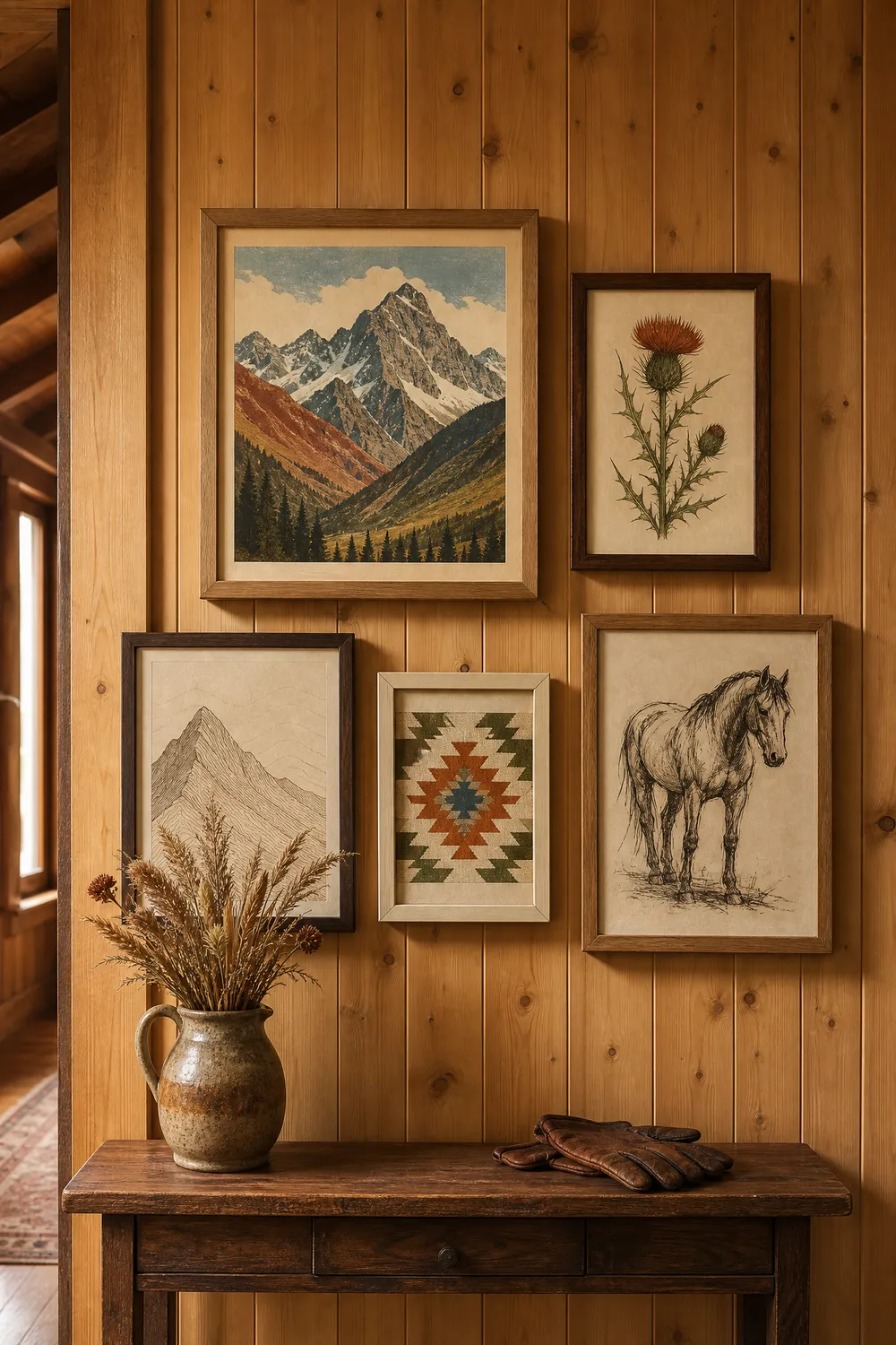
2. Alpine botanical illustrations. Edelweiss, gentian, alpine thistle, pine and larch branches. Antique-plate style with visible paper texture. These are the pieces that keep the wall from reading as purely graphic.
3. Topographic and contour line art. A single peak rendered as contour lines, or a minimalist elevation profile. Quiet enough to sit between two louder posters without competing.
4. Western and equestrian sketches. This is the “Dutton Ranch” half of the Sikes quote — pencil or ink studies of horses, saddles, ranch buildings. Keep them loose and unfinished-looking rather than photorealistic.
5. Retro European travel posters. Beyond ski resorts: rail routes, lake steamers, spa towns. Same visual family, more variety, and they carry the “slightly European” note in the trend’s definition.
6. Nordic and Fair Isle pattern prints. Country Living notes “the occasional Fair Isle or Nordic note” fits the look. A geometric knit-pattern print in earth tones works as a small filler piece and ties the wall to the textiles in the room.
What is the palette?
Country Living describes it qualitatively: “Cozy earth tones ground the palette, happily accented by a pop of creamy white or an unexpected blue.” No specific colour codes were published, so treat that as a direction rather than a formula — warm browns, rust, ochre, forest and moss greens, with cream doing the lifting and one cooler blue as the accent.
The practical version for choosing prints: pick art whose dominant tones are warm and slightly desaturated, as if the paper has aged. Anything with a bright, cool, high-contrast palette will fight the timber and leather this look is built on.
| Pair earth tones with | Effect | Frame choice |
|---|---|---|
| Timber panelling, warm oak | The core look — art disappears into the wall in a good way | Natural oak, unfinished |
| Caramel or cognac leather | Rich, lived-in, slightly masculine | Walnut or dark oak |
| Cream, oatmeal, undyed wool | Softens the whole scheme, keeps it from going heavy | Cream-painted or pale oak |
| One unexpected blue | The accent Country Living calls for — use it once, not everywhere | Thin black or dark walnut |
| Cool grey, chrome, stark white | Flattens the warmth entirely — avoid | — |
What sizes should you print?
Two separate size systems, and it is worth keeping them separate rather than treating them as interchangeable.
Common frame sizes sold in inches, converted exactly (1 inch = 2.54 cm):
| Frame size | In centimetres |
|---|---|
| 5 × 7 in | 12.7 × 17.8 cm |
| 8 × 10 in | 20.3 × 25.4 cm |
| 11 × 14 in | 27.9 × 35.6 cm |
| 16 × 20 in | 40.6 × 50.8 cm |
| 18 × 24 in | 45.7 × 61.0 cm |
| 24 × 36 in | 61.0 × 91.4 cm |
And the ISO 216 paper sizes, which are genuinely metric rather than converted:
| Paper size | In centimetres |
|---|---|
| A4 | 21.0 × 29.7 cm |
| A3 | 29.7 × 42.0 cm |
| A2 | 42.0 × 59.4 cm |
These two systems are close but not equal. A4 is 21.0 × 29.7 cm and an 8 × 10 inch frame is 20.3 × 25.4 cm — an A4 print will not sit correctly in an 8 × 10 frame without a mat cut for it. Decide which system your frames use before you print, not after.
For this particular look, one large anchor piece at roughly 45 × 60 cm or larger, surrounded by three to five smaller pieces between A4 and 28 × 36 cm, gives the collected-over-years effect the trend is after.
How do you arrange it so it looks collected?
The failure mode with any vintage-inspired gallery wall is symmetry. A grid of identical frames reads as a purchase; the look you want reads as an accumulation.
Three things that help. Vary the frame finishes deliberately — mixing oak, walnut and one cream-painted frame looks intentional in a way that six identical frames does not. Hang the arrangement lower than feels right, ideally with the centre of mass around 145 to 150 cm from the floor, so it relates to the furniture rather than floating. And leave the spacing slightly uneven, roughly 5 to 8 cm between frames, rather than measuring every gap to the millimetre.
If you are hanging above a sofa, keep the whole arrangement inside the width of the sofa and start about 15 to 20 cm above the back cushions.
One note on paper
Matte, always, for this look. A textured or fine-art matte stock at 230 to 300 gsm reads as a vintage poster; the same image on glossy photo paper reads as a photograph of a vintage poster. If you are printing at home, matte photo paper is the single upgrade that makes the most visible difference here, more than the printer itself.
Print at 300 DPI at your final size. If a file looks soft when you preview it at full size on screen, it will look soft on the wall — scale down to the next frame size rather than printing it large and hoping.
Pin this guide
Save this for when you start your autumn wall — the size conversions and the palette pairings are the parts worth having on hand when you are standing in the frame aisle.
Pin 1 of 2 — save to Pinterest 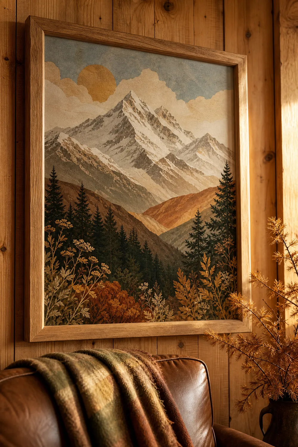
Pin 2 of 2 — save to Pinterest