What Rewild actually is
The 2027 Colormix Trend Forecast was announced on 30 July 2026. Sherwin-Williams describes it as “a forward-looking collection of 48 handpicked hues that invites designers, homeowners and paint professionals to explore color in ways that feel more expressive, personal and intuitive.”
The structural change matters more than the colours. Instead of the brand’s previous palette groupings, 2027 is split into three named design stories — Revive, Reignite and Reconnect — tied loosely to past, present and future. Emily Kantz, Color Strategist and Interior Designer at Sherwin-Williams, frames the shift plainly: “Rather than prescribing how colors should be used, we’re inviting designers, homeowners and professional paint contractors to explore the possibilities for themselves.”
That is a gift for anyone choosing art, because a mood is something you can match a print to. A colour code is not.
One note before the practical part. Sherwin-Williams does not publish hex or RGB values in the release, so nothing below invents one. Where a colour is named, its SW code is given so you can pull the real chip rather than trust a screen — and screens misrepresent deep greens and oxbloods more than almost any other family.
The ten colours worth anchoring a wall to
New for 2027, the forecast introduces ten Continuity Colors — shades Sherwin-Williams describes as “relevant today and years from now” that “transcend trends” and pair with any other Rewild hue to ground a palette.
For art buyers these are the ten to care about, because a print chosen against a colour that survives the trend cycle keeps working after the trend passes:
| Continuity Colour | SW code |
|---|---|
| Forged Steel | SW 9565 |
| White Duck | SW 7010 |
| Dutch Tile Blue | SW 0031 |
| High Sierra | SW 9588 |
| Cordovan | SW 6027 |
| Roycroft Bronze Green | SW 2846 |
| Clove | SW 9605 |
| Icicle | SW 6238 |
| Red Barn | SW 7591 |
| Celery | SW 6421 |
The rest of the forecast — 38 further hues across the full colour range — includes shades like Taiga (SW 9654), Universal Khaki (SW 6150), Midnight (SW 6264), Bitter Chocolate (SW 6013) and Mauve Finery (SW 6282).
Revive: heritage, patina, and the case for old-looking art
Sherwin-Williams describes Revive as “unapologetic splendor, heritage revival, and timeworn touches… reemerging with quiet authority. In an age of automation, craftsmanship and heirloom sensibility feel both nostalgic and necessary.”
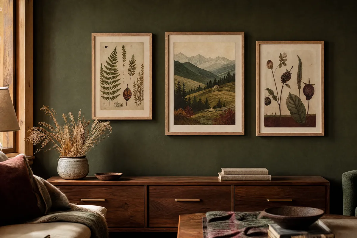
What to print for it: antique botanical plates, old master studies, vintage map reproductions, architectural drawings, still lifes with visible brushwork. The quality that ties them together is evidence of a hand — texture, imperfection, paper that looks like it has aged.
Frame it in something with presence. This is the one story in the forecast where a wide or dark-stained frame reads as intentional rather than fussy. Cordovan (SW 6027) and Clove (SW 9605) are the natural wall colours behind it.
Reignite: the confident, saturated middle
Reignite sits in the present tense of the three. In art terms this is where colour does the work rather than texture: bold abstracts, high-contrast graphic shapes, a single saturated field, mid-century-influenced geometry.
If you are nervous about committing a whole wall to a strong colour, this is the story where a print does the job instead. One large saturated piece against a quiet wall gives you the same energy as a painted feature wall, and costs a great deal less to change your mind about.
Reconnect: the one most printable art already fits
Reconnect is described as seeking “deeper ties at the intersection of human and nature,” with “a growing respect for local traditions, ancient wisdom, and viewing the earth as a living collaborator.”
This is the story that maps most directly onto what people actually buy: pressed botanicals and herbarium studies, landscape photography, topographic and contour line art, seed and pod illustrations, mineral and shell studies, quiet horizon abstracts.
If you take one thing from the forecast, take this: the greens are doing the heavy lifting for 2027, and they are earthy rather than bright. Roycroft Bronze Green (SW 2846), Celery (SW 6421) and Taiga (SW 9654) all sit in that register. Art with olive, moss and bronze-green tones will look correct in a lot of rooms next year.
What pairs with what
| Wall direction | Art that works | Frame |
|---|---|---|
| Deep bronze-green (SW 2846) | Pressed botanicals, pale landscapes, cream-ground studies | Pale oak or brass |
| Oxblood and cordovan (SW 6027) | Heritage plates, dark still lifes, gold-toned abstracts | Dark walnut or thin gold |
| Warm putty and White Duck (SW 7010) | Almost anything — the safest gallery-wall backdrop here | Mixed finishes, deliberately |
| Clove brown (SW 9605) | Botanical line art, sepia photography, muted horizons | Cream-painted or pale oak |
| Muted delft blue (SW 0031) | Shell and mineral studies, coastal horizons, ink drawings | White or pale oak |
The one combination to avoid: a cool grey wall behind any Rewild green. These greens carry warmth, and cool grey drains it out until they read as tired rather than earthy.
Sizes, in centimetres
Two separate systems, kept separate because they are not interchangeable.
Common inch-based frame sizes, converted exactly (1 inch = 2.54 cm):
| Frame size | In centimetres |
|---|---|
| 8 x 10 in | 20.3 x 25.4 cm |
| 11 x 14 in | 27.9 x 35.6 cm |
| 16 x 20 in | 40.6 x 50.8 cm |
| 18 x 24 in | 45.7 x 61.0 cm |
| 24 x 36 in | 61.0 x 91.4 cm |
And the ISO 216 sizes, which are genuinely metric rather than converted:
| Paper size | In centimetres |
|---|---|
| A4 | 21.0 x 29.7 cm |
| A3 | 29.7 x 42.0 cm |
| A2 | 42.0 x 59.4 cm |
A4 is 21.0 x 29.7 cm and an 8 x 10 inch frame is 20.3 x 25.4 cm. Close, not equal, and an A4 print will not seat correctly in an 8 x 10 frame without a mat cut for it. Decide which system your frames use before you print.
For a Rewild-led wall, one anchor piece at 45 x 60 cm or larger, with three to five smaller works between A4 and 28 x 36 cm, gives the collected look all three stories are reaching for.
One note on paper
Deep greens and oxbloods are the two families that suffer most on cheap stock. A matte or textured fine-art paper at 230 to 300 gsm holds them; thin glossy photo paper flattens a bronze-green and pushes an oxblood toward purple. If you print at home and only upgrade one thing this year, upgrade the paper before the printer.
Print at 300 DPI at final size. If it looks soft at full size on screen, it will look soft on the wall.
Pin this guide
Worth keeping for autumn, when the 2027 palettes start appearing everywhere — the Continuity Colour list and the pairing table are the parts you will actually want with you in the shop.
Pin 1 of 1 — save to Pinterest