So buy the print for the daylight hours and hang it for the night ones. Put it where the lamp cannot mirror in the glass, because after dark that single lamp is the brightest thing in the room. Keep the glazing matte, or leave it out. Beside a 53 cm changing table, one A2 print at 42.0 x 59.4 cm leaves 11.0 cm of bare wall, which is enough.
What a night light actually puts out
Start with the only numbers anyone publishes.
IKEA’s MÖRKRÄDD LED nightlight with sensor is listed with a luminous flux of 5 lm, a diameter of 45 mm and a power of 0.45 W, and its page says “Light colour: warm white (2700 Kelvin).”
Hold that against a normal bulb from the same catalogue. IKEA’s SOLHETTA E27 806 lumen bulb publishes 806 lm at the same 2700 K. That is 161 times the light at the same colour of white, which is our own arithmetic on the two published figures: 806 divided by 5.
The kelvin figure they share is doing less work than people think. The US Department of Energy’s fact sheet on LED colour characteristics, April 2016, puts it plainly: correlated colour temperature “characterizes the appearance of the emitted light, not the color of illuminated objects.” The same sheet adds that a figure like 2700 K is usually “a nominal designation” covering a range of real values. Under the EU ecodesign rules the printed figure is rounded to the nearest 100 K before it reaches the box.
Two lamps can both read 2700 K and do very different things to a room, because one of them is putting out a hundred and sixty times more light.
The number that decides the colour is not kelvin
It is how much light comes back off the wall, and the standards body has drawn that line.
The CIE’s international lighting vocabulary defines photopic vision as vision in which cones are the principal active photoreceptors, notes that it “normally occurs when the eye is adapted to levels of luminance of at least 5 cd·m −2”, and then states: “Colour perception is typical of photopic vision.”
At the other end it defines scotopic vision, the rod-driven kind, as what “normally occurs when the eye is adapted to levels of luminance of less than 0,005 cd·m −2”, and says it “is characterized by the lack of colour perception and by a shift of the visual sensitivity function towards shorter wavelengths”. The CIE writes luminance as cd·m −2, meaning candela per square metre, and uses a decimal comma.
Between those two sits the mesopic range, where rods and cones are both working, and where the thing people actually notice happens. The CIE calls it the Purkinje phenomenon: the “reduction in the brightness of a predominantly long-wavelength colour stimulus relative to that of a predominantly short-wavelength colour stimulus, when the luminances are reduced in the same proportion”, with “the wavelength of maximum efficiency being displaced towards the shorter wavelengths”. A 2018 review in Annual Review of Vision Science, hosted by the US National Library of Medicine, says the same thing in one line: “But perceived colors change under mesopic conditions.”
Warm reds and terracottas are long-wavelength. Sage, dusty blue and grey-green are short. As the light drops, the warm end of a print loses brightness against the cool end faster than it does by day. Nobody we read puts a number on that for a framed print in a bedroom, so there is no number for it here either.
Our own arithmetic, with every assumption on the table
One worked example, so those ranges mean something. This is arithmetic, not a measurement, and the assumptions are ours.
Take the 5 lm night light. Assume it throws its light into a hemisphere, which gives 5 divided by 2 pi, or 0.796 candela. Assume a wall 2.0 m away and light falling square on it: 0.796 divided by 2.0 squared is 0.199 lux. For a surface that scatters evenly, luminance is reflectance times illuminance divided by pi.
A pale ground reflecting 0.80 of the light comes out at 0.051 cd/m2. A very dark ground reflecting 0.05 comes out at 0.0032 cd/m2, which is under the CIE’s 0,005 line. Both sit far below the 5 cd/m2 where the CIE says colour perception is typical, and the dark one crosses into the range the CIE describes as lacking colour perception.
The reflectance figures are illustrations, the beam is a guess because the product page gives no beam angle, and a real room bounces light off the ceiling and the floor, so real values are higher than these. What survives all of that is the ratio: a dark ground returns about one sixteenth of what a pale one does, whatever the lamp. In a room lit by one small lamp, pale-ground artwork is the one still doing something.
CRI is published for the bulbs and not for the night light
Colour rendering is the other number on a lamp box, and it is worth knowing where it stops.
Philips Hue publishes a colour rendering index of 80 for its White B39 candle bulb at 2700 K. IKEA’s SOLHETTA page goes further: “A value above 80 is good and close to a natural light. This light bulb has an index of 90.”
The EU sets a floor under those numbers. Regulation (EU) 2019/2020 requires “CRI ≥ 80” for light sources from 1 September 2021, with exceptions for discharge lamps and for outdoor and industrial use. The catch is the definition. The same regulation defines a light source as a product with, among other characteristics, “a luminous flux between 60 and 82 000 lumen”. The night light publishes 5 lm. Its page publishes no colour rendering index at all, and there is none anywhere else on it.
The Department of Energy sheet is careful about what the number means in any case: CRI “is a measure of average fidelity”, and “two sources with the same CRI value can render colors very differently”. It is a useful floor and a poor prediction of what one particular picture will look like.
Matte or glossy, under a single small lamp
By day a nursery is lit through a window, and the light arrives from a wide area. At night it arrives from one small source, and that changes which finish is comfortable to look at.
The CIE calls the problem a veiling reflection: a “specular reflection that appears on the object viewed and that partially or wholly obscures the details by reducing contrast”. A glossy surface or a sheet of glass sends that single lamp straight back at one angle. A matte surface scatters it instead.
Scattering does not get rid of it. Tru Vue, which makes framing glass, publishes its own figures: Conservation Clear glass reflects 8 percent double-sided, its Reflection Control glass also reflects 8 percent, described on that page as “8% scattered light”, and only the coated Museum Glass drops under 1 percent. The matte glass changes how the reflection comes back, not how much of it there is.
For a printable in a shop frame, the cheap version of that rule is placement. Stand where you stand at 3 a.m., look at the frame, and move the lamp rather than the picture.
The wall beside the changing table, in centimetres
This is the wall you look at while someone small is being changed at night, so it is the one worth planning.
Changing tables are not a standard width. IKEA publishes 53 cm for the SNIGLAR, 78 cm for the SUNDVIK changing table and chest of drawers, and Stokke publishes 67 cm wide, 75 cm deep and 106 cm high for the Stokke Care. A 25 cm spread across three ordinary products.
Work from your own table width and the A-series, whose millimetre sizes are listed in the international paper sizes reference kept at the University of Cambridge: A2 is 420 x 594 mm, A3 is 297 x 420 mm, A4 is 210 x 297 mm. In centimetres, 42.0 x 59.4, 29.7 x 42.0 and 21.0 x 29.7.
Our own arithmetic on those two sets of numbers, for a block of art no wider than the furniture under it:
| Table width | What fits above it | Wall left over |
|---|---|---|
| 53 cm (SNIGLAR) | one A2, 42.0 cm wide | 11.0 cm |
| 67 cm (Stokke Care) | two A3 side by side, 59.4 cm | 7.6 cm |
| 78 cm (SUNDVIK) | two A3 side by side, 59.4 cm | 18.6 cm |
| 78 cm (SUNDVIK) | three A4 side by side, 63.0 cm | 15.0 cm |
Those gaps are the total, so halve them for the margin on each side, and take the frame’s own moulding off before you commit. No source gives a correct height or gap for art beside a changing table, and we are not inventing one.
Two safety lines do come from a paediatric body, and both are about the lamp rather than the picture. The American Academy of Pediatrics’ checklist for making a baby’s room safe says: “Keep night-lights away from drapes or bedding where they could start a fire. Buy only cool night-lights that do not get hot.” The same page asks for a changing table with “a 2-inch (5-cm) guardrail around all four sides”, which is the page’s own rounding of 5.08 cm.
The wall above the cot is a different question with a firmer answer, and it is not this one: three bodies in three countries say to leave that strip as paint and wallpaper.
What this guide will not tell you
No claim here about what a baby sees. We looked for a paediatric or ophthalmological source on infant vision under a night light and did not find one, so there is nothing in this guide about what the child perceives from the cot. The person reading the wall at 3 a.m. is the adult.
No claim that a particular colour goes dull. The CIE gives the direction of the shift, not a result for pigment on paper, and no measurement of a print under a night light turned up anywhere.
No claim that pale prints glare. The glare that is documented comes off the glazing and belongs to the lamp’s position, not to the ground tone of the artwork.
The print in the photographs
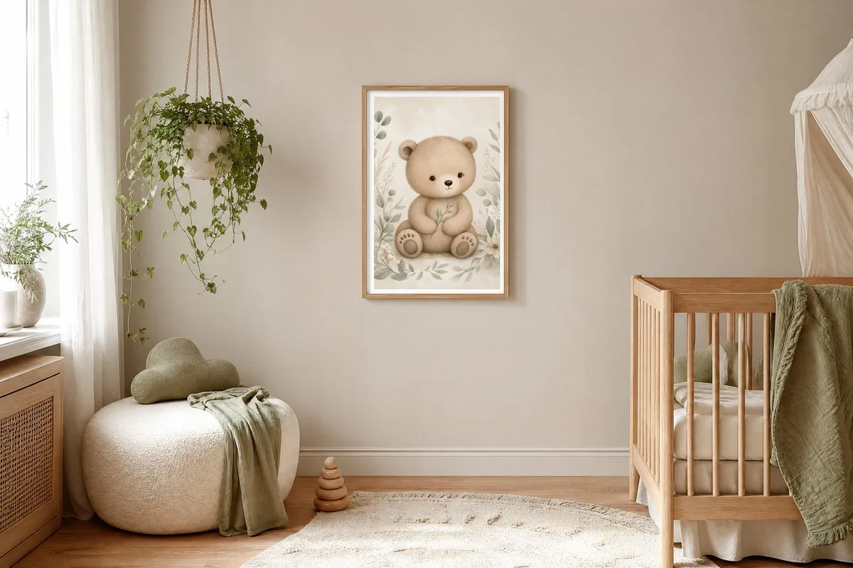
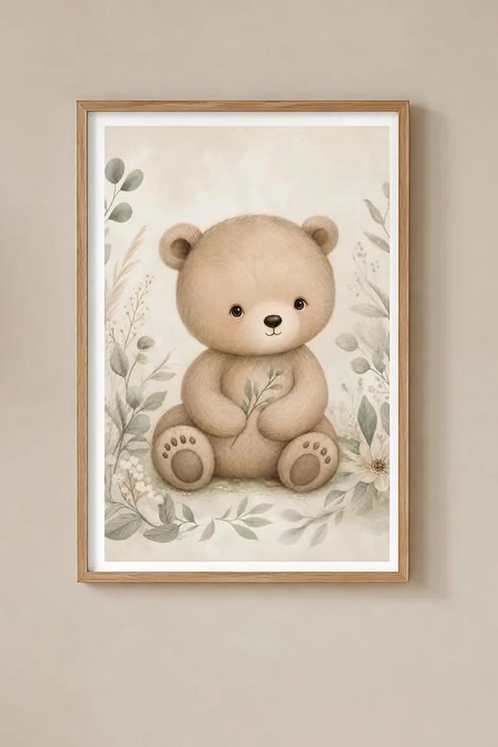
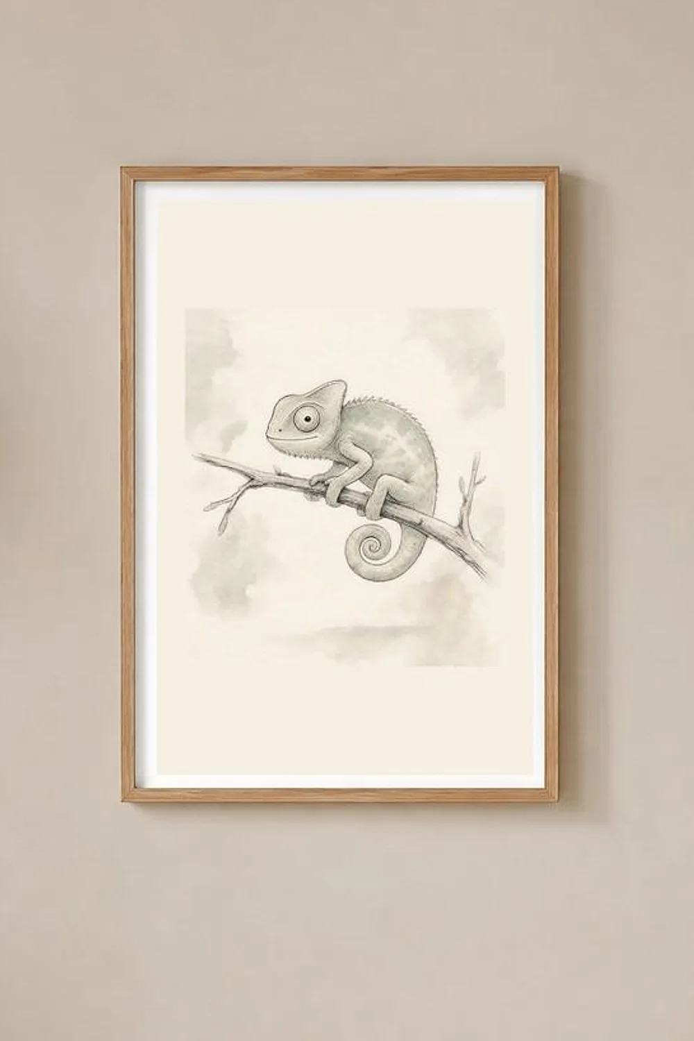
The piece at the top is Boho Baby Bear Nursery Print, a soft pencil-and-wash bear on a cream ground with eucalyptus around it. The second frame further down is Safari Nursery Decor, a sage chameleon on the same kind of pale ground. Both are from our own shop, which is why they are in the photographs, and both are the pale-ground case this guide argues for.
Sources
- IKEA, MÖRKRÄDD LED nightlight with sensor, 5 lm and 2700 K: ikea.com
- IKEA, SOLHETTA LED bulb E27 806 lumen, 2700 K and a colour rendering index of 90: ikea.com
- Philips Hue, White B39 candle E14, 2700 K and CRI 80: philips-hue.com
- US Department of Energy, “LED Color Characteristics” fact sheet, April 2016, on what CCT and CRI do and do not describe: energy.gov
- CIE, international lighting vocabulary, photopic vision 17-22-016: cie.co.at
- CIE, scotopic vision 17-22-017: cie.co.at
- CIE, Purkinje phenomenon 17-22-036: cie.co.at
- CIE, veiling reflection 17-22-101: cie.co.at
- Grimes, Songco-Aguas and Rieke, “Parallel processing of rod and cone signals”, Annual Review of Vision Science, 2018: pmc.ncbi.nlm.nih.gov
- Regulation (EU) 2019/2020, the CRI minimum of 80 from 1 September 2021 and the 60 to 82 000 lumen definition of a light source: eur-lex.europa.eu
- Tru Vue, published reflection figures for Conservation Clear, Reflection Control and Museum Glass
- American Academy of Pediatrics, “Make Baby’s Room Safe: Parent Checklist”, on night-lights and changing-table guardrails: healthychildren.org
- IKEA SNIGLAR changing table, 53 cm wide: ikea.com
- IKEA SUNDVIK changing table and chest of drawers, 78 cm wide: ikea.com
- Stokke Care, 67 cm wide, 75 cm deep and 106 cm high: stokke.com
- ISO 216 A-series sizes in millimetres, University of Cambridge Computer Laboratory: cl.cam.ac.uk
The candela, lux and cd/m2 figures in the worked example, the 161 times comparison and the four rows of the table are our own arithmetic on the published figures above, with the assumptions stated where they are used. No measurement of a print under a night light appears in this guide, because we could not find one.
Pin this guide
Worth keeping if you are planning a nursery wall rather than buying one print. The table of changing-table widths against A-series sizes is the part to have open while you measure, and the lamp advice costs nothing to try tonight.
-
Pin 1 of 2, save to Pinterest -
Pin 2 of 2, save to Pinterest