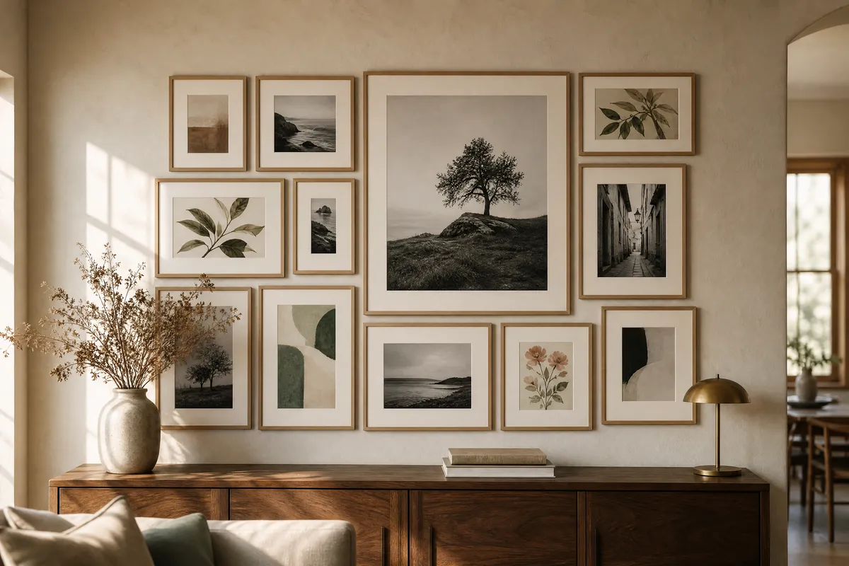
That is not a taste problem. The walls that look casual are the ones following a method, and the method is old. Hang everything from a single anchor piece, unify the frames, group by story rather than by size, and leave a consistent gap of 5 to 8 cm between pieces.
The rest of this guide is how to do each of those on a real wall, with real measurements.
The look you are copying has a name
On 13 August 2026, Grazia ran a piece on Paul McCartney’s dining room that opens on exactly the frustration above — trying to recreate a gallery wall and getting “a cluster of mismatched prints that felt more chaotic than curated.”
The arrangement it describes is the salon hang: artwork stacked close together, often floor to ceiling, treating the whole wall as one composition rather than a row of separate pictures. Grazia traces the format to the 1670s and the French academy exhibitions, which is roughly right — the packed, edge-to-edge hang is the style those salons made famous, and it is where the modern gallery wall comes from.
One thing to be clear about, because it matters for what you hang: McCartney’s wall holds original paintings and monochrome photographs. The article is not about printables, and it never mentions them. We are borrowing the composition, not the collection. The method works the same whether the frames hold originals, family photographs or downloads — the wall reads as a whole, and the whole is what people see first.
Start with one piece, not a plan
The single most useful idea in the Grazia piece comes from Martin Waller, founder of the design house Andrew Martin, who is quoted on how he builds these walls. His approach starts with one anchor piece and builds outward, letting instinct lead more than a ruler.
That is the opposite of how most people do it. Most people pick a grid, then go looking for enough prints to fill it. That is why the result looks bought — because it was.
Practically, on a wall:
- Pick the largest or most personally significant piece. That is your anchor.
- Put it slightly off-centre on the wall, not dead centre. A perfectly centred anchor makes everything around it look like packaging.
- Build outward from it in both directions, adding the next piece where it balances the last.
Waller’s own framing, as Grazia reports it, is that the best gallery walls feel as though they evolved over time rather than being clinically measured into existence. Aim for that and you will forgive yourself a lot of small irregularities.
Frames do the unifying, so pick one frame
If your prints vary in subject, era and colour — and on a good wall they should — then the frames are what hold the composition together. On McCartney’s wall, simple uniform frames are what let bold colour sit next to black-and-white photography without the wall falling apart.
This is the single highest-leverage decision in the whole project, and it is the one most often got wrong. A mixed-frame wall can work, but it is an advanced move and it needs another unifying element doing the job instead — a single colour running through every image, or one consistent mat width.
For a first gallery wall, use one frame profile and one finish throughout. Vary the size, not the style.
If you want the frame to do more work visually, a wider mat is the cheapest upgrade available. A 40 × 50 cm frame with a 5 cm mat gives you a 30 × 40 cm image with real presence. The same frame with no mat holds a bigger print but reads as cheaper.
Group by story, not by size
Waller’s suggestions here are specific and worth stealing directly:
- If you have two portraits, face them toward each other, as though they are in conversation.
- Group a theme together — all the animals, say — even when the styles and eras have nothing in common.
- Surround a set of monochrome pieces with one vividly colourful work at the centre.
- Do not avoid putting very contemporary work in a traditional room, or the reverse. The clash is often the point.
The last one is the one people talk themselves out of. A stark modern print in a room full of dark wood is not a mistake, it is the thing that makes the wall interesting.
The measurements that actually matter
This is where a gallery wall is won or lost, and it is mostly one number.
Gap between frames: 5 to 8 cm. Keep it consistent. This is the setting that separates a composition from a scatter. Tighter than about 5 cm and the wall reads as one dense block, which is a legitimate salon look but unforgiving of any error. Wider than about 8 cm and the pieces stop belonging to each other.
Pick your number, then use a strip of card cut to that exact width as a spacer while you hang. Do not measure each gap individually — you will drift.
Plan it on the floor first. Lay out the whole arrangement on the floor in front of the wall, in the size it will occupy, and move things until it works. Then photograph it from directly above with your phone. That photograph is your hanging plan.
Paper templates beat regret. Cut a sheet of paper to the exact outer size of each frame, and tape them to the wall with low-tack tape in your planned arrangement. Stand back. Live with it for a day. Paper costs nothing and nail holes cost an afternoon.
Total footprint. A gallery wall generally wants to occupy somewhere around two-thirds of the width of whatever furniture sits under it. Over a 180 cm sideboard, that means the whole arrangement wants to be roughly 120 cm wide. Narrower and it looks stranded; wider and it starts to overhang.
For hanging height and the eye-level maths, we have already covered that in detail in the complete guide to sizing, printing, framing and hanging — no need to repeat it here.
A wall that is not symmetrical
Most real walls have something in the way: a mantel, a light switch, a radiator, a door frame that lands off-centre.
The salon hang handles this better than a grid does, which is the practical argument for using it. A grid needs a true centre line to work against. An anchor-and-build arrangement does not — it just needs a starting point, and an obstacle can be the starting point.
Over a mantel, set the anchor piece off to one side rather than centring it on the mantel’s midpoint, then let the arrangement run longer on the opposite side to balance the weight. The eye reads the total mass, not the geometry. If a wall has a light switch in the middle of your intended area, build the arrangement so the switch falls inside a gap rather than fighting it.
What to hang
Since the frames are doing the unifying, the images can be far more varied than instinct suggests. A workable starting set for a first wall:
- One anchor, larger than everything else — 40 × 50 cm or 50 × 70 cm.
- Three or four mid-size pieces at 30 × 40 cm.
- Two or three small ones at 21 × 30 cm (A4) or 13 × 18 cm to fill the awkward gaps.
Mix orientation. An all-portrait wall looks like a catalogue page. One or two landscape pieces break the rhythm and make the whole thing look considered.
And the rule Grazia closes on is the right one to end on: only frame things that actually mean something to you. A wall assembled purely to fill a space looks exactly like a wall assembled purely to fill a space, however good the spacing is.
Pin this guide
Save any of these to your Pinterest boards — they link straight back to this guide.
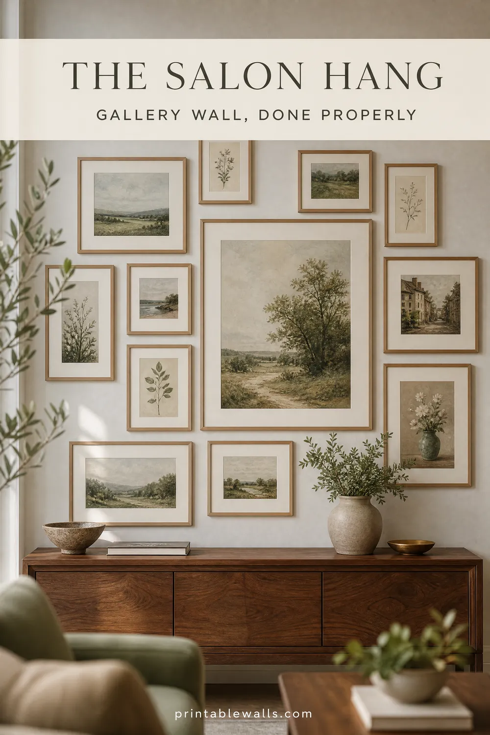
Pin 1 of 2 — save to Pinterest 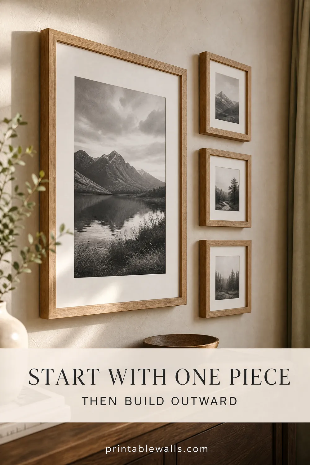
Pin 2 of 2 — save to Pinterest