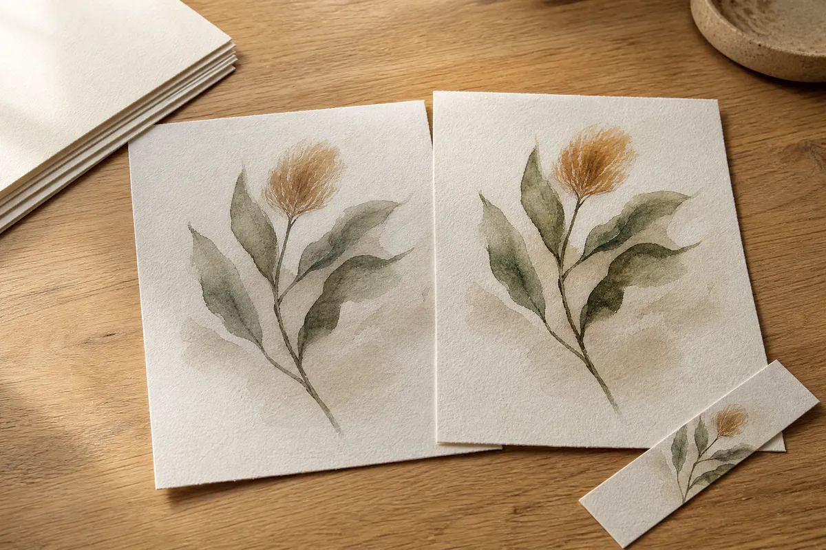
The file is almost certainly fine. So is your printer.
What has gone wrong is that the file was carrying instructions about its own colour, and somewhere between your screen and the paper nothing read them. That set of instructions is called a colour profile, and getting it read correctly is the last piece of print quality that this site has never explained.
We have covered the paper and the sizes and when to print at home versus sending it out. This is the other half.
The screen is lit. The paper is not.
Start here, because everything else follows from it.
A screen makes its own light. It shows you a colour by emitting it. Paper has no light of its own — it can only reflect whatever is falling on it, minus whatever the ink absorbs. A black on a screen can be a switched-off pixel. A black on paper is a layer of ink under your kitchen bulb at ten in the evening.
So a print can never be a copy of the screen. It can only be a good translation of it.
That is not a defect in your printer, and no setting will make paper glow. What settings can do is make the translation honest rather than approximate, and the difference between an honest translation and an approximate one is most of the gap you are seeing.
What a colour profile actually is
A colour profile is a small description attached to a file that says what its colours mean. Not “this pixel is 40% blue” but “this particular blue, on this particular kind of device.”
Without one, a number is just a number, and every device is free to guess what it meant. Guesses do not agree with each other. That is the drift.
The organisation that defines the format is the International Color Consortium, and it states its own purpose plainly: “to promote the use and adoption of open, vendor-neutral, cross-platform color management systems.”
This is a real standard with a long paper trail, not a setting somebody invented. The ICC’s v4 specification was first approved as an International Standard, ISO 15076-1, in 2005 and revised in 2010. The current version is 4.4.
The people who agreed to this are the people who made your kit
This is the part that makes the whole thing feel less abstract.
The ICC lists Adobe, Agfa, Apple, Eastman Kodak and Microsoft as its Founding Members. Its Regular Members include Canon, HP, Nikon, Fujifilm, Datacolor and X-Rite. Its steering committee includes Adobe, Apple, Microsoft, HP and Seiko Epson.
Read that list again and notice what it is. It is your laptop, your phone, your photo software and, in all likelihood, your printer. The companies on both ends of your printing chain agreed on how colour should be described between them, decades ago, and the agreement is still being maintained.
Which means the mechanism to get an accurate print is already sitting in your devices. Usually nobody has told it what paper you are about to use.
The two-minute fix
Almost every disappointing home print comes down to three things, and none of them require buying anything.
Tell the printer what paper is in the tray. This is the single biggest one. A printer lays down a different amount of ink for matte, for glossy, for heavy card. If the driver thinks it is printing on plain office paper and you have fed it 230 gsm matte, it will under-ink and the result reads exactly as you described: flat and washed out. The setting is in the print dialog, usually called Media Type or Paper Type. Change it before you change anything else.
Let one thing manage colour, not two. In the print dialog there is normally a colour handling option, and both your application and your printer driver are capable of doing the job. If both do it, the file gets translated twice and the second translation is working from an already-altered version. Pick one, set the other to off or to “no colour management”. Which one you pick matters less than that only one is doing it.
Print a test strip before the full sheet. Not the whole A3. Print a 10 x 15 cm crop of the darkest and most colourful part of the image on the actual paper you intend to use, under the light the finished piece will hang in. Two minutes and a few pence, against a wasted sheet of good paper.
Do those three and most of the gap closes. Not all of it — see above about paper not glowing — but most.
Judge it under the light it will live in
A print that looks grey on your desk at midnight may look exactly right above the sideboard at four in the afternoon.
Paper reflects the light in the room, so the room is part of the artwork. Warm bulbs push a print warmer. North-facing daylight is cooler and less forgiving of muddy darks. If you assess a new print under one light and hang it under another, you are marking the wrong exam.
Hold the test strip on the wall where the piece is going, at the time of day you will actually be looking at it, before you decide anything is wrong.
When this matters, and when it does not
It genuinely does not matter much for a small print in a busy arrangement. An A5 at 14.8 x 21.0 cm or an A4 at 21.0 x 29.7 cm, matte, one of nine things on a gallery wall, seen from two metres away — nobody is comparing that to a screen, and a slightly quiet print often sits better in a group than a vivid one.
It matters a great deal for a single large piece carrying a wall on its own. At 50 x 70 cm, or A2 at 42.0 x 59.4 cm and up, the image is the thing you look at rather than part of a pattern, and flat darks are visible from across the room.
That is also the point where sending the file out stops being an indulgence. A print shop has profiled its machines against its own papers, which is the whole job described above done properly with measuring equipment. Our guide to printing at home versus using a shop covers where that line usually falls on cost.
What this will not fix
Colour management makes the translation faithful. It cannot rescue a file that was never good.
If a downloaded print is low resolution, no profile will sharpen it. If it was exported small and you are enlarging it to 50 x 70 cm, it will still be soft. If it is genuinely a bad piece of artwork, it will be a faithfully reproduced bad piece of artwork. Those are separate problems, and the complete guide covers what to check before you buy.
But if you have a good file that printed disappointingly, the odds are strong that nothing was wrong with the art and everything was wrong with the handover. Set the paper type, let one thing manage the colour, print a test strip, and look at it under the right light.
Most of the time, that is the whole repair.
Pin this guide
Save any of these to your Pinterest boards — they link straight back to this guide.

Pin 1 of 2 — save to Pinterest 
Pin 2 of 2 — save to Pinterest