The article then lists twenty things to buy. Lamp shades, a rattan side table, ceramics, table linen, a duvet cover. Not one print, not one frame, not one piece of wall art.
Which is a strange gap, because one of the designers quoted in that very article names artwork as part of how the palette gets layered into a room.
So this is the missing piece. What actually works on a brown-and-blue wall, which tones to look for, which to avoid, and the sizes in centimetres that make an arrangement sit properly.
What the designers actually said
Two on-record quotes carry the piece, and both are worth reading before you buy anything.
Hero Dalrymple, Creative Director at Albion Nord:
A rich blue and brown color palette transcends trends. This combination is rooted in nature and evokes a sense of peace and permanence. Blue exudes calmness and works beautifully with browns and the naturally warm tones of wood.
And interior designer Nina Farmer, describing a recent living room:
I love pairing blue and brown because it’s one of the most timeless color combinations. Walnut paneling brings warmth and richness, while the soft blue upholstery adds a sense of calm and keeps the room feeling light. By layering these tones throughout the furnishings, textiles, and artwork, the palette feels collected, balanced, and inviting rather than overly coordinated.
Read Farmer’s list again. Furnishings, textiles, and artwork. The wall is not an afterthought in her description of how this palette works. It is one of the three places the colours are supposed to repeat.
That is the whole argument for hanging something considered rather than whatever you already own.
Why this pairing is unusually forgiving to hang against
Most trend colours make life harder for art. A saturated wall competes with whatever goes on it, and you spend the next year working around a decision you made in an afternoon.
Brown and blue does the opposite, for a reason that is structural rather than fashionable.
The two sit on opposite sides of the warm-cool divide. Blue reads cool, brown and wood read warm. A room built on both already contains its own balance, which means a print does not have to supply one. You are adding to a conversation that is working, not refereeing one that is not.
Dalrymple’s phrase for it is that the combination is rooted in nature. That is also the practical clue for what to hang: the pairing already exists outdoors, everywhere, and art that echoes where it comes from tends to settle in immediately.
What to hang: four subjects that work
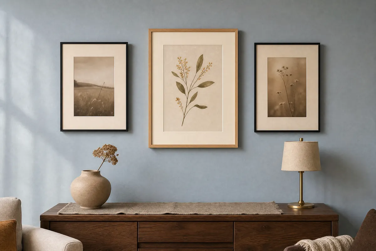
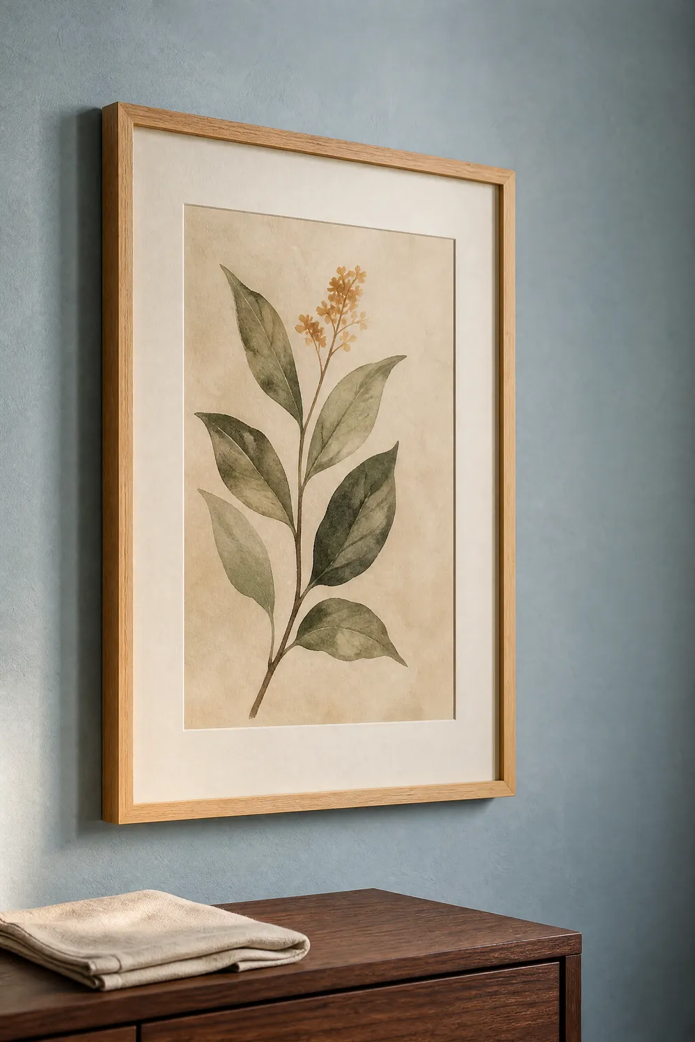
Botanical studies in muted greens and warm neutrals. The natural bridge between the two colours. Green sits between blue and brown on the wheel and belongs to both. A single stem study on a warm off-white ground does more work than its size suggests.
Warm-toned monochrome photography. Not cold grey. Look for prints that run toward sepia, warm charcoal, or soft brown-black. These pick up the walnut and wood tones without introducing a fourth colour into the room.
Quiet abstract forms in ochre, rust or clay. One warm accent, used sparingly. This is the note that stops a brown-and-blue room going flat, and it is much easier to control in a print than in furniture.
Landscape and coastal work with a low horizon. The literal version of Dalrymple’s point. Sand and water, earth and sky. It reads as calm rather than themed as long as the blue in the print is softer than the blue on the wall.
What to avoid
Cool grey prints. They look neutral on a screen and go flat and slightly dead against warm wood. Grey is the most common mistake in this palette.
A second, brighter blue. If a print carries a blue more saturated than the wall, the wall stops being the calm background and starts looking like the wrong choice. Keep print blues quieter than the room.
Anything with a strong black frame plus a stark white mount plus a high-contrast image. That combination is a gallery look, and it fights the softness the whole palette is built on.
Prints where the brown is a red-brown. Mahogany and terracotta tones clash with the walnut and putty browns this trend is actually about. Look for browns pulled toward taupe, coffee and clay.
Sizes, in centimetres
The A-series is defined in metric, which makes it the easy route. The sizes are set by ISO 216 and stated directly in millimetres in the CSS Paged Media specification:
| Size | Dimensions |
|---|---|
| A5 | 14.8 x 21.0 cm |
| A4 | 21.0 x 29.7 cm |
| A3 | 29.7 x 42.0 cm |
| A2 | 42.0 x 59.4 cm |
Alongside those, most European frame ranges carry a parallel set of round metric sizes that are not A-series at all: 30 x 40 cm, 40 x 50 cm, 50 x 70 cm. These are the sizes most often stocked with a pre-cut mount, and they are the ones worth buying into if you want a mount without cutting one.
Two things worth knowing before you order.
Every A size is exactly half the next one, so an A-series file scales between A5, A4, A3 and A2 without cropping. The round metric sizes do not share that relationship with each other or with the A-series, so a file made for 30 x 40 cm will not drop cleanly into 50 x 70 cm.
And a mount changes the size you need. A 30 x 40 cm frame with a pre-cut mount typically shows an opening around 21 x 29.7 cm, which means an A4 print. Buy the frame first, read the opening, then buy to the opening.
A three-print arrangement that sits properly
The simplest arrangement that looks deliberate rather than accidental is three prints in a level row.
Use one larger print in the centre, at 40 x 50 cm, with two smaller ones either side at 30 x 40 cm. Hang them so the centres align horizontally rather than the tops or bottoms, because the eye reads the middle of a frame, not its edge.
Leave 5 to 8 cm between frames. Closer than 5 cm and the group reads as one crowded object; wider than about 10 cm and it stops reading as a group at all.
Hang the centre of the arrangement at roughly 145 cm from the floor. That is a little below standing eye level, which is right for a wall you mostly see while sitting down.
That spacing and height guidance is ours, not Homes & Gardens’. It is the arrangement we would hang against this palette, offered as a starting point rather than a rule.
Mounts and frame finishes
Warm blond oak is the safest frame for this palette, because it belongs to the brown side of the room without repeating the exact tone of the furniture.
Slim matte black works as a second finish, used for one or two frames in a group rather than all of them.
Walnut frames are tempting and usually a mistake, for the reason Farmer’s quote hints at: if the room already has walnut panelling or walnut furniture, a walnut frame disappears into it and the print loses its edge.
Skip silver, chrome and any cool metallic. They introduce exactly the cold note the palette is built to avoid.
For mounts, use a chalky off-white or a soft oatmeal rather than a bright white. Bright white against a warm brown-and-blue room reads as a small cold rectangle around every print.
What we are not claiming
Homes & Gardens’ piece is a trend report and a shopping roundup. It carries two named designers on record and no numbers at all: no search-volume figures, no sales data, no percentage of designers surveyed. We have not added any, because none exist in the source.
So treat this as what it is. Two respected designers say a pairing is working and a major shelter title agrees, which is a reasonable signal about where decorating is going this autumn and no kind of proof.
The colour advice above is our own, built on how the two colours behave together rather than on anything the article claims. The article’s own contribution is Farmer’s line about layering the tones through artwork, and that one sentence is the reason this post exists.
Pin this guide
Save any of these to your Pinterest boards — they link straight back to this guide.
Pin 1 of 2 — save to Pinterest 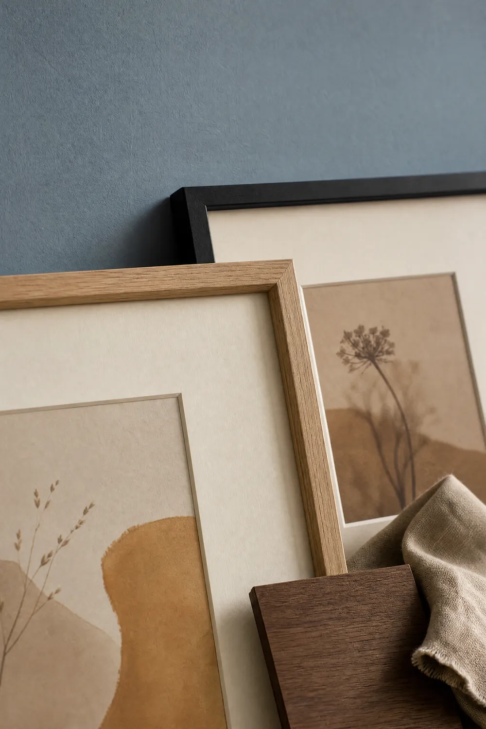
Pin 2 of 2 — save to Pinterest