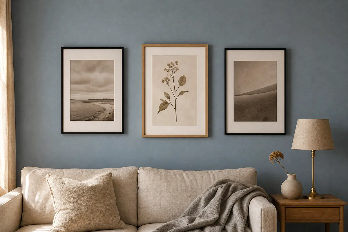
What Cottage Door actually is
Valspar’s own description, from its announcement on 5 August 2026, is “a reflective mid-tone neutral blue that creates spaces that feel authentically lived-in and quietly confident.”
Sue Kim, Director of Color Marketing at Valspar, put it this way: “Cottage Door celebrates the unique beauty inside us all. This mid-tone neutral blue is reflective and warm, with timeless appeal that feels personal and grounding.”
Two practical things sit inside that language.
The first is the word neutral. A neutral blue is one that has been pulled toward grey rather than toward either green or violet, so it reads as a soft mid-tone rather than as a statement. In a room it behaves closer to a warm grey than to a colour.
The second is that Valspar describes it as carrying warm and cool undertones at once. That is unusual and it is the whole reason this colour is easy to hang against, which is the point of the rest of this guide.
Valspar also names two companion colours: Moon Shot (8005-2B), a soft warm-toned grey, and Apricot Blush (8003-8A), a muted creamy pink. Those two matter more than they look, because they tell you where the blue wants to be pushed if you add a second colour to a room.
One honest note before anyone tries to colour-match it on a screen. Valspar published the paint code but no hex or RGB value, and we are not going to estimate one from press photography. If you need an exact match, take the code to a paint counter. Every screen render of Cottage Door you find online, including any on this page, is an approximation.
Where you can buy it, and why that matters for matching
Valspar is a Lowe’s paint brand. The announcement lists availability at Lowe’s stores nationwide, Lowes.com, the Lowe’s mobile app, and independent home improvement retailers.
That is a US distribution footprint, and worth saying plainly if you are reading this from anywhere else: you may not be able to buy this exact paint. The good news is that nothing in this guide depends on you buying it. A mid-tone neutral blue with balanced undertones is a describable colour, not a proprietary one, and any decent paint counter can mix toward that description. What follows works for the colour family, not the tin.
How it sits next to the forecast we covered last week
We wrote about Sherwin-Williams’ Rewild forecast on 30 July — 48 hues across three moods. Two 2027 announcements in eight days is a genuine pattern rather than a coincidence, and Forbes framed Valspar as first out of the gate for the 2027 season. That framing is Forbes’, not a measured fact, and it looks right as far as we could check: no other major brand appears to have declared for 2027 yet.
The interesting part is that both brands went to blue, and not to the same blue.
| Colour | Brand | Character |
|---|---|---|
| Cottage Door (8004-38E) | Valspar | Mid-tone, neutral, warm and cool undertones together |
| Dutch Tile Blue (SW 0031) | Sherwin-Williams, in Rewild | A muted delft blue, more pigmented, more historical |
| Icicle (SW 6238) | Sherwin-Williams, in Rewild | A pale, cool, barely-there blue |
Cottage Door sits between those two. It is more present than Icicle and calmer than Dutch Tile Blue, which means art chosen for either of the Rewild blues will generally work against it. If you already made choices off last week’s guide, you do not need to redo them.
The art that does not fight a quiet blue
A neutral blue is a background colour, and background colours reward one strong piece rather than a busy wall.
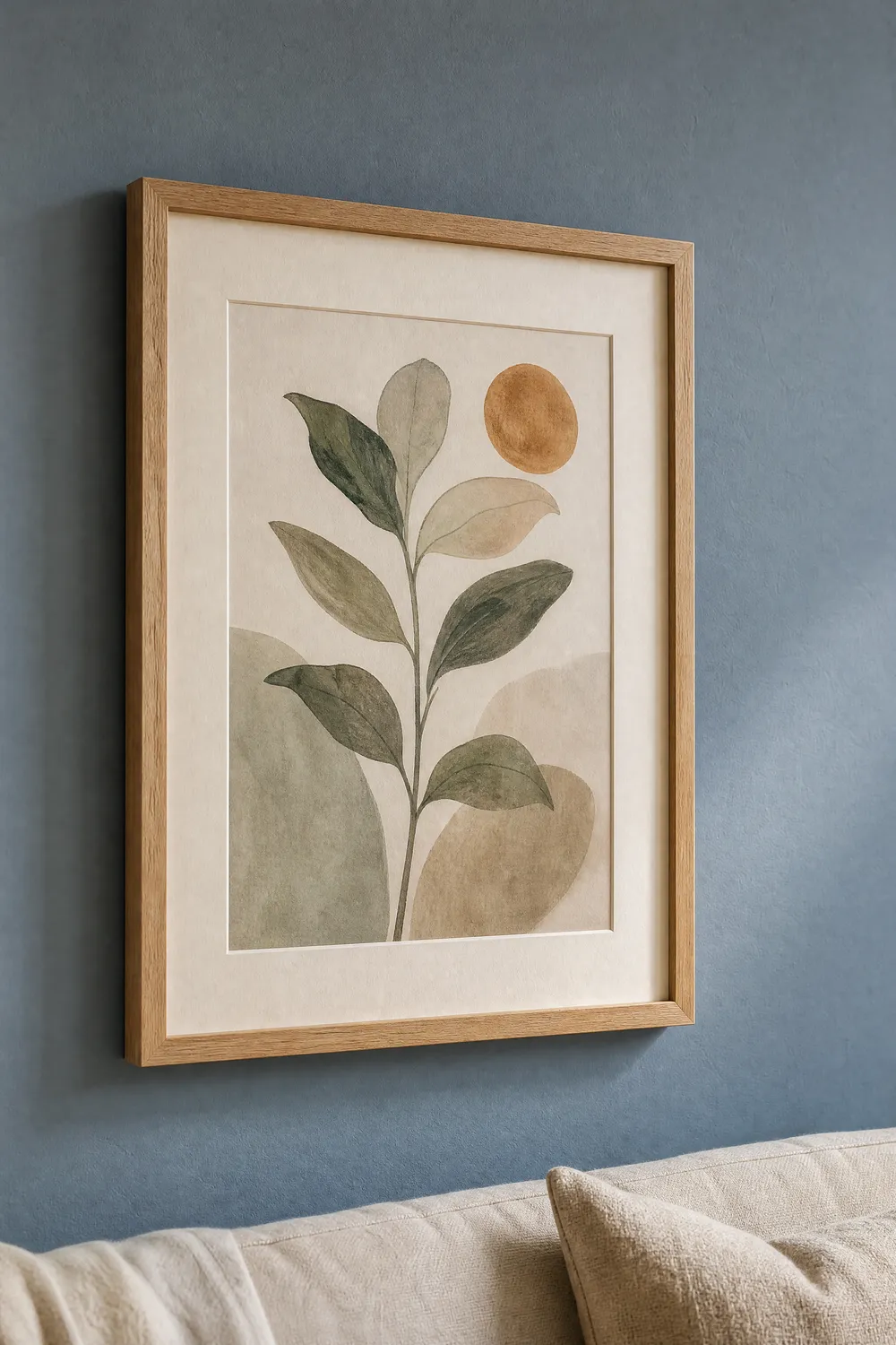
Botanical line art. The single most reliable pairing. A green-leaning botanical will pick up the cool side of the wall, and a sepia or ink one will pick up the warm side. Either works, which is the advantage of an undertone-balanced wall.
Warm-toned black and white photography. Not cold, blue-black monochrome, which disappears into the wall. Photographs with a warm or slightly sepia black point separate cleanly and look considered rather than accidental.
A single saturated abstract. This is the move that makes the room. One piece with real colour in it — a rust, a deep ochre, a muted terracotta — against an otherwise quiet wall. Apricot Blush being one of Valspar’s own companion colours tells you the brand is thinking the same way: this blue wants a warm accent, not another cool one.
Architectural and shell studies. Anything with a chalk or plaster quality in the paper white. These read as part of the wall rather than as objects hung on it.
The genre to think twice about is heavily saturated cool-toned art — bright teals, cobalt, cold greens. Not because it looks bad, but because it makes the wall look like a failed attempt at the same colour. If you want blue art on a blue wall, go much darker or much paler than the wall and skip the middle.
Frame finishes that agree with the undertone
This is where most gallery walls go wrong, and it is a two-minute decision.
Light oak and ash. The safest choice, and the one that leans into the warm half of the undertone. Pale wood against a mid-tone blue is the pairing that reads as intentional in almost every room.
Warm-toned grey or greige. Effectively Moon Shot as a frame instead of as a wall. Quiet, slightly formal, good in a bedroom.
Slim black. Works, with one condition: it needs a wide mount. A black frame tight to the image against a mid-tone wall reads as heavy. Give it 5 to 7 cm of white or off-white mount and it turns crisp instead.
Cool silver and chrome. The one to skip. Silver pulls the wall toward its cool undertone and the whole arrangement goes slightly cold and slightly dated. Valspar’s own companion palette points warm; the frames should too.
Walnut sits in between. It works if the art is warm, and it can feel muddy if the art is cool.
Sizes, in centimetres
Two systems, kept separate because they are not interchangeable.
Common inch-based frame sizes, converted exactly at 1 inch = 2.54 cm:
| Frame size | In centimetres |
|---|---|
| 8 x 10 in | 20.3 x 25.4 cm |
| 11 x 14 in | 27.9 x 35.6 cm |
| 16 x 20 in | 40.6 x 50.8 cm |
| 18 x 24 in | 45.7 x 61.0 cm |
| 24 x 36 in | 61.0 x 91.4 cm |
And the ISO 216 sizes, which are genuinely metric rather than converted:
| Paper size | In centimetres |
|---|---|
| A4 | 21.0 x 29.7 cm |
| A3 | 29.7 x 42.0 cm |
| A2 | 42.0 x 59.4 cm |
| A1 | 59.4 x 84.1 cm |
For a quiet wall like this one, the arrangement that works hardest is a single anchor piece at 50 x 70 cm or larger, hung on its own. A mid-tone neutral wall gives a large single work enough contrast to hold a room, and a busy grid throws that advantage away.
If you want more than one piece, three works at A3 in matching frames, spaced 5 to 7 cm apart, is the least risky gallery arrangement against a colour like this. Keep the centre of the group at eye level, around 145 to 150 cm from the floor.
One note on printing a warm accent
If your one saturated piece is a rust, ochre or terracotta, print it on a matte or textured fine-art stock at 230 to 300 gsm. Warm earth tones on thin glossy photo paper go slightly orange and slightly plastic, and against a calm wall that is the one error you will notice every day. Our print at home versus print shop comparison covers where the cost lands either way.
Print at 300 DPI at final size, and check the file at full size on screen before committing.
Pin this guide
Worth keeping for the autumn repaint season — the frame-finish list and the pairing notes are the parts you will want with you at the paint counter.
Pin 1 of 2 — save to Pinterest 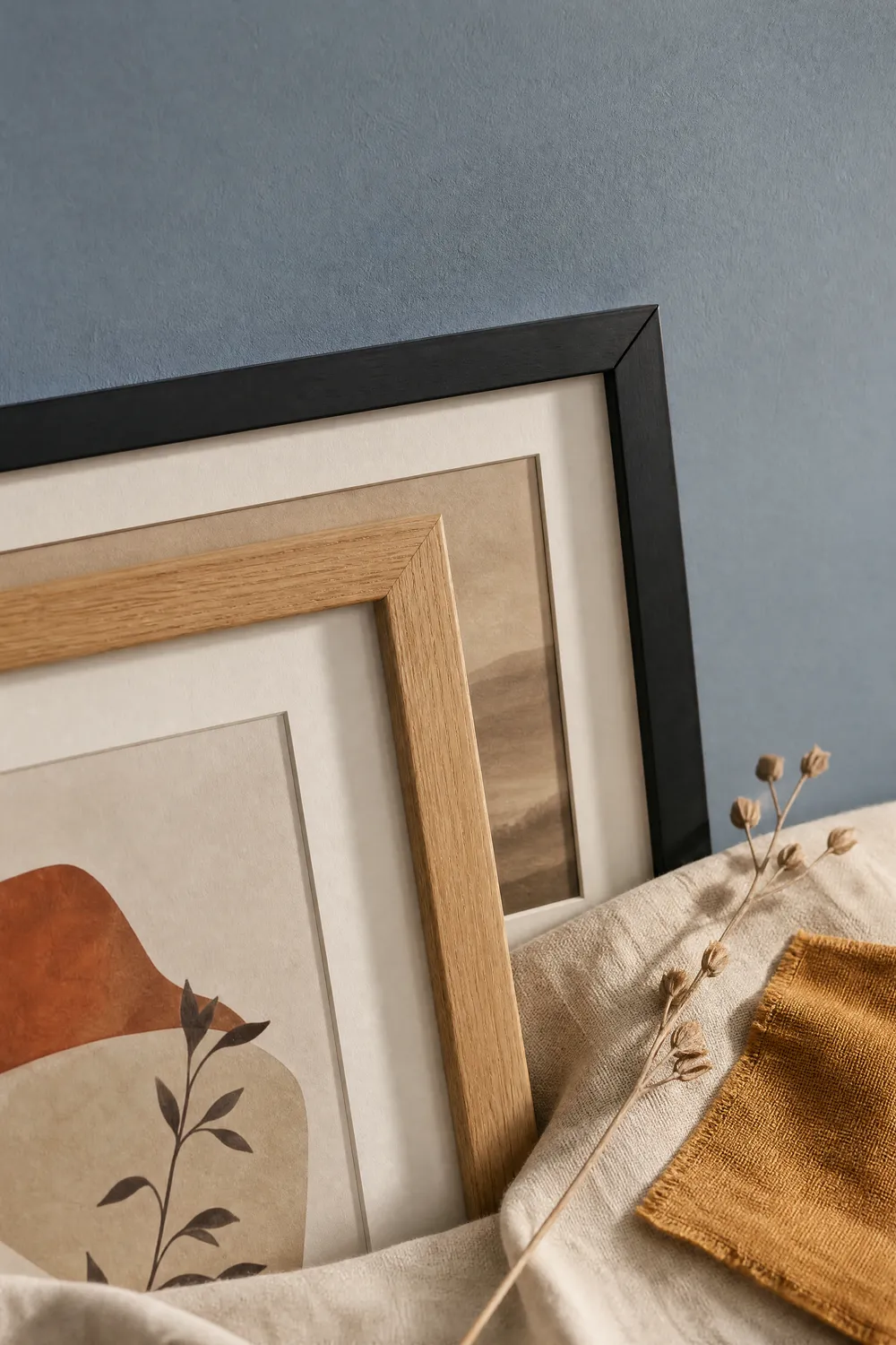
Pin 2 of 2 — save to Pinterest